
Why I Got Color Analysis In My 50s (And What I Learned for you)
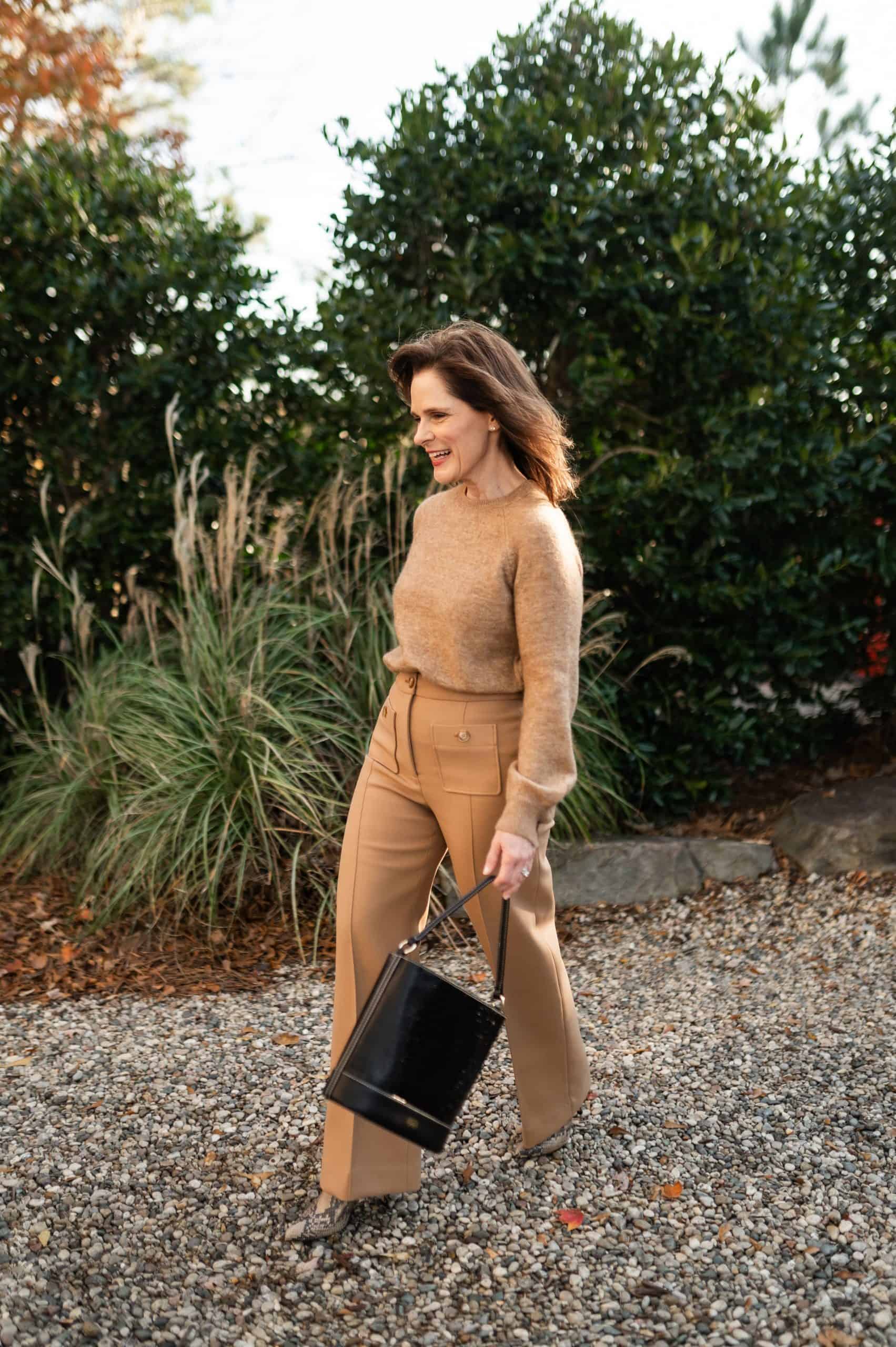
Color analysis in your 50s may seem like something you should have done years ago, but for me, it was something I had been curious about for a long time and simply never made time for. After working in fashion for many years, including more than a decade selling Carlisle, I always felt like I had a good sense of what colors looked best on me. Over time, I naturally gravitated toward certain shades that seemed to work, but I had never actually gone through a professional color analysis to understand exactly why those colors worked so well.
As my style has evolved in midlife, I have become much more intentional about the pieces I add to my wardrobe. I want the things I buy to work together, flatter my complexion, and feel timeless rather than trendy. Also, as I’ve gotten older, I’ve become more intentional about everything from skincare to style, which I share more in my guide on how to look better in your 50s. That curiosity is what finally pushed me to book a professional color analysis appointment and learn more about the colors that truly suit me.
When Ellen Hake of Ellen’s Beauty Bar walked me through the draping process, the results confirmed something I had suspected for years. I fall into the Dark Autumn color palette, which explains why I tend to look and feel my best in rich, warm shades like camel, chocolate brown, olive, and deep rust.
And once I understood that, it completely changed the way I think about shopping and building outfits.

What is Color Analysis?
Color analysis is a process used to determine which colors are most flattering for your natural coloring. A trained color analyst looks at your skin tone, hair color, and eye color to determine whether warm or cool tones work best for you.
During the appointment, different colored fabrics are draped under your face so you can see how each shade affects your complexion. Some colors make your skin look brighter and more even, while others can make you look tired or washed out.
The goal of color analysis is to identify a palette of colors that naturally complement our features, so getting dressed becomes easier and more cohesive.
Why I Decided to Get a Personal Color Analysis in my 50s
Even though I had been curious about color analysis for years, I finally decided that getting a color analysis in my 50s made sense because my work now involves being photographed regularly for the blog and social media. When you are in front of the camera that often, you quickly realize that some colors make your skin look bright and healthy, while others can make you look tired or washed out.
I don’t want to look just okay in photos. I want to look polished and confident. Since I spend time creating outfits and photographing them for SASforShort, it made sense to understand which colors actually help me look my best.
Another reason I wanted to do this was to simplify my wardrobe decisions. Over the years, I noticed that I kept reaching for the same shades again and again, especially warm neutrals like camel, chocolate brown, and olive. Having a professional color analysis done felt like a way to confirm what was working and give me a clearer guide for future purchases
Now, when I shop, I can be much more intentional about the colors I bring into my wardrobe, which makes everything easier to mix and match.
What Happens During A Color Analysis Appointment
If you have never experienced color analysis in your 50s or at any stage of life, the process is actually very interesting to see in person. Most professional color analysts will ask you to arrive with no makeup so they can clearly see your natural skin tone and undertones. That allows them to determine which colors truly complement your complexion.
The appointment itself usually involves a process called draping, where different colored fabrics are placed around your shoulders and under your face. As the color changes, you can see how certain shades brighten your skin while others make shadows or dullness more noticeable.
A full personal color analysis appointment can take up to two hours, because the analyst is carefully testing different color families, contrast levels, and understones. During my session, Ellen walked me through several stages of draping to determine whether I feel into a warm or cool palette and how deep or soft my best colors should be.
By the end of the process, it became clear that my most flattering palette is Dark Autumn, which includes rich, warm, slightly deeper colors that work beautifully with my complexion.
My Result: The Dark Autumn Color Palette
One of the most interesting parts of doing color analysis in my 50s was seeing how different colors affected my complexion in real time. As Ellen draped different fabrics under my face, some colors immediately made my skin look brighter and more even, while others made me look washed out or even tired.
After testing several color families, it became clear that my most flattering palette is Dark Autumn. This palette includes rich, warm colors with a little depth to them, which explains why I have always been drawn to shades like camel, chocolate brown, olive, rust, and deep reds.
Understanding this palette has been incredibly helpful because it gives me a framework when I shop. Instead of guessing whether a color will work, I now know that warm, slightly deeper tones tend to be the most flattering on me.
Finding the Right Metallics
One of the first things Ellen tested during my appointment was how different metallic tones looked against my skin. Metallics can reveal a lot about whether someone has warm or cool undertones.
When the gold drape was placed under my face, my complexion looked brighter and more balanced. This was one of the first clues that my coloring fell on the warm side of the spectrum, which is typical for Autumn palettes.

Testing Whites and Creams
Another interesting step was testing different versions of white. Many people assume white is neutral, but there are actually several variations that can look very different depending on your undertones.
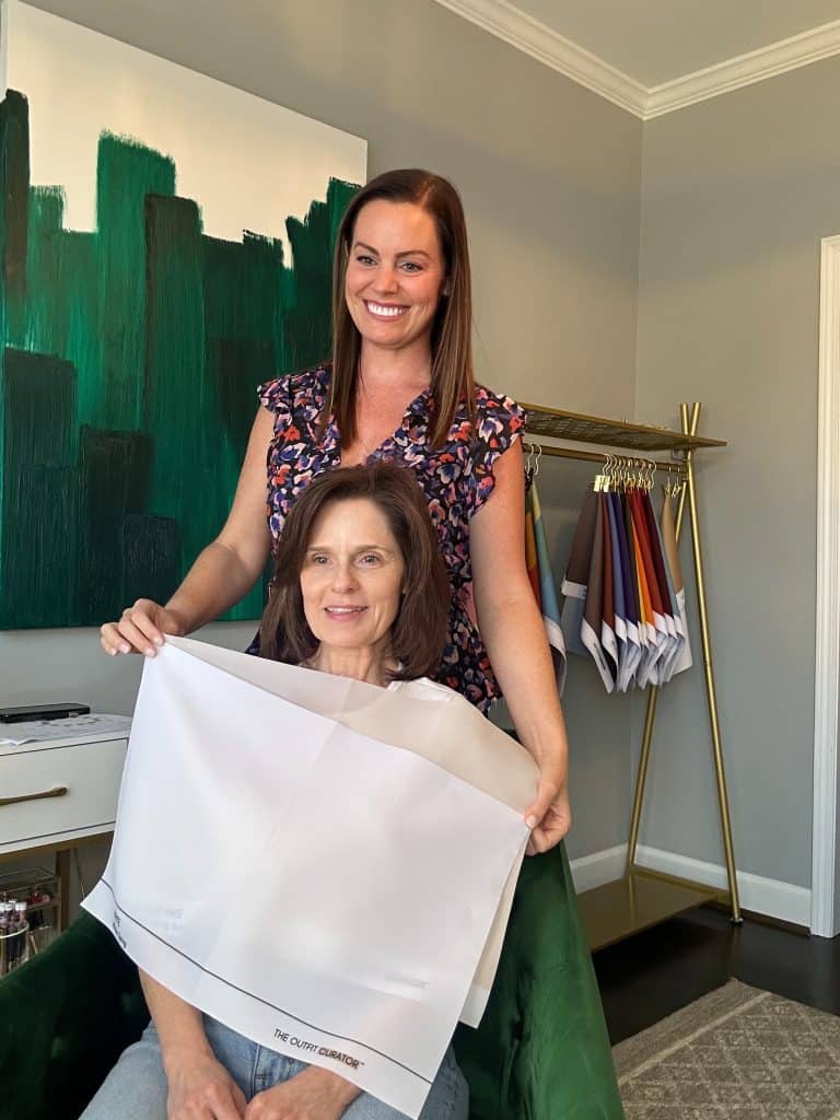
When Ellen draped different whites under my face, we could see that softer, warmer whites were the most flattering on me. Shades like ivory and cream helped brighten my complexion and looked more harmonious with my natural coloring.

That said, I was happy to learn that I can still wear white. While bright, cool whites are not technically my best shade, I still enjoy wearing white pieces in my wardrobe, especially in the warmer months.
Discovering the Dark Autumn Palette
The Dark Autumn palette includes deeper, richer shades that still have warmth to them. Colors like olive green, rust, burgundy, chocolate brown, and warm teal all sit beautifully within this palette.

Seeing these colors together made everything click for me. Many of the shades I already owned and loved were right there in the Dark Autumn palette, which confirmed why those colors had always felt like “me”.

How Color Analysis Changed the Way I Shop
One of the biggest benefits of doing color analysis in my 50s is that it has made shopping much easier. Instead of trying to decide whether a color might work, I now have a clear palette to guide my choices.
Before my color analysis, I often bought pieces simply because I liked the style or the fit. Sometimes those pieces worked beautifully in my wardrobe, and other times they ended up sitting in my closet because the color just didn’t feel quite right.

Now, when I shop, I pay much more attention to whether a color falls within my Dark Autumn palette. Shades like camel, chocolate brown, olive, rust, and warm ivory tend to be the most flattering on me, and they also mix beautifully in outfits. These warm neutrals are also the reason I gravitate toward pieces like camel boots and chocolate brown accessories.
This has helped my wardrobe feel much more cohesive. When many of your pieces fall within a similar color family, it becomes much easier to mix and match items and build outfits. I’ve noticed this especially when putting together seasonal looks like the ones I shared in my spring trends for petite women over 50 guide.
Color analysis has also been helpful when it comes to makeup. For example, warm coral tones tend to work especially well with my coloring, which is why I often reach for my favorite coral lipstick shades.
Understanding Sister Seasons

Another helpful takeaway Ellen shared during my appointment is that you don’t have to stay strictly within your palette all of the time. Your seasonal palette simply represents the colors that are most naturally flattering on you.
However, you can also borrow from what are sometimes called your “sister seasons”. These are the palettes that sit next to your primary season and share similar characteristics.
Since my palette is Dark Autumn, my sister seasons include Warm Autumn, Soft Autumn, and even some Dark Winter shades. That means I can comfortably wear many colors from those palettes as well, especially when they are close to the deeper, warmer tones that work best for me.
Knowing this makes color analysis feel much more flexible. Instead of limiting your choices, it simply gives you a helpful starting point for understanding which colors tend to make you look your best.
Is Color Analysis Worth It in Your 50s?
If you are considering color analysis in your 50s, I do think it is worth it.
Your style often becomes more refined in midlife. You know what you like. But you may still feel unsure about which colors truly suit you best. That is exactly where color analysis can help.
It gives you a clear starting point. You understand which tones brighten your skin and which ones do not. I’ve found that when your colors, skincare, and overall routine all work together, it makes a noticeable difference, especially as we get older. It’s never too late to have a great anti-aging skincare routine .
For me, it removed a lot of guesswork when shopping. I now reach for colors I know will work. That alone has made my wardrobe feel more cohesive. It also helped me feel more confident in front of the camera. I know the colors I am wearing are working with my complexion, not against it.
That said, I do not think of it as a strict set of rules. I still wear colors I love, even if they are not in my core palette. I see color analysis as a helpful guide. It makes getting dressed easier, but does not limit your personal style.
Where I Had My Color Analysis Done
If you are local to the Atlanta area and thinking about color analysis in your 50s, I had a wonderful experience working with Ellen Hake.
She walked me through the entire process step by step. Everything was explained clearly, which made it easy to understand what we were seeing during the draping.
One of the most helpful takeaways from the session was the color fan she gave me. It includes my best shades within the Dark Autumn palette. I can keep it in my purse when I am shopping in stores or have it nearby when I am browsing online.
She also followed up with a detailed PDF after the appointment. That included my full palette along with my sister seasons, which has been helpful when I want a little more flexibility with color.
Having both of those tools has made it much easier to apply what I learned in real life. I can quickly check whether a color will work before making a purchase.
If you are curious about having your colors done. I would absolutely recommend working with her. You can find more information and book an appointment with her here.
Final Thoughts
Going through color analysis in your 50s was something I had wanted to do for year. I am so glad I finally did it.
It confirmed what I already suspected about the colors I naturally reach for. It also gave me more clarity and confidence when I shop.
My wardrobe feels more cohesive now. Getting dresses feels easier. And I feel more confident in front of the camera.
Most importantly, it helped me understand that color should work with you, not against you.
Thanks, Let’s Keep In Touch
If you enjoy practical style advice like this, I would love to have you join my newsletter.
Each week, I share outfit ideas, beauty favorites, and the pieces I am actually wearing and loving right now.
Frequently Asked Questions About Color Analysis
Is color analysis worth it after 50?
Yes, especially if you want to simplify your wardrobe and feel more confident in what you wear. Color analysis gives you a clear understanding of which shades are most flattering for your complexion.
How long does a color analysis appointment take?
Most appointments take between one and two hours. During that time, the analyst uses draping techniques to test different colors and determine your seasonal palette.
Do you have to follow your color palette all the time?
No. Your palette is a guide, not a set of rules. You can still wear colors you love. Understanding your best colors simply helps you make more intentional choices.
Can you still wear black if you’re an autumn palette?
Yes, but it may not be your most flattering shade. Many Dark Autumn palettes look better in deep browns, warm charcoals, or softer dark tones. That said, you can still wear black if you enjoy it.
Can you do color analysis online?
There are online tools available, but an in-person appointment is usually more accurate. Seeing the colors against your skin in natural light makes a big difference.


Very inspiring post. Your confidence is glowing :),
Thank you Jody. The power of color is amazing.
Beth